
Defining Semantic Color Variables
Although Syngenta has been in the agriculture business since 2000, the Digital Product Engineering (DPE) department has only been around since 2019. This leaves our global product design chapter in a unique environment that can feel like a start-up, a rapidly growing company, and/or an incredibly large corporation depending on the situation.
Our Cropwise contribution-style design system previously had only a single primitive color palette with very limited documentation for the usage of some colors. This led to a wide range of inconsistency across products and left designers manually translating screens into dark-mode.
With the addition of the variables feature inside of Figma in 2023, I saw the opportunity to better define our colors and reduce the manual effort for dark-mode to virtually zero. So during our first ever Design System Week, I dedicated my contribution efforts towards creating semantic color variables.
-
Primary contributing designer
-
Syngenta, a global agtech enterprise corporation
-
Figma Branch Reviewers:
· Nick Alonso-Emanuel, NA lead
· Maisie Rose, NA designer
· Viviane Ferraz, LATAM designer -
Design System Week
11-20 March 2024
Define
Problem #1
Dependency on a primitive Cropwise color palette leads to visual inconsistencies in production.
A color palette with a naming convention defined only by hue and value (E.G. “green-60” or “neutral-100”) doesn’t intuitively inform designers of the use case for each color. This coupled with a lack of documentation has led to inconsistent implementation both within individual products and across products of the same global Cropwise brand. The level is so severe that there has been expressed confusion and open debate over when blue or green should be considered our primary call-to-action color.
But more than cause designers a massive headache, these inconsistencies negatively affect our user experience. Varied and conflicting color patterns can confuse and frustrate users. This can hinder or even disrupt user flows, resulting in reduced engagement time, a higher chance for abandonment, and damaged brand image.
Designers looking for a color in Figma will find color styles defined by only hue and value, not use.
The only documentation designers can find is within the Figma library file page “colors” and it isn’t very clear.

Sample of the variation in headers

Sample of the variation in the usage of blue
Sample of the variation in buttons

Sample of the variation in hover interaction
Problem #2
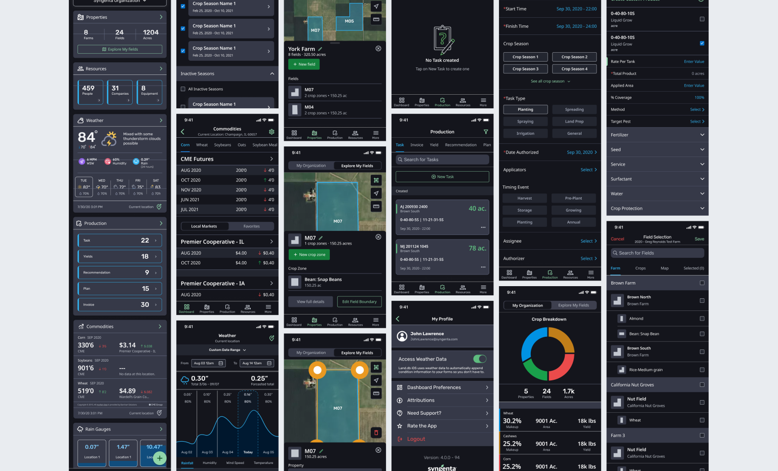
Manually designed dark-mode creates handoff hiccups and accessibility concerns.
Despite a few Cropwise products using dark-mode, there has never been any global documentation to formally define how a designer should interpret the single primitive color palette for dark-mode. Instead, all decisions and documentation have been left up to the individual product design teams to manage at a local level.
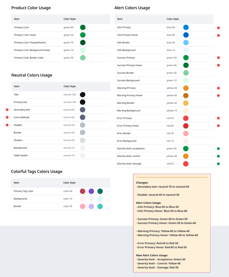
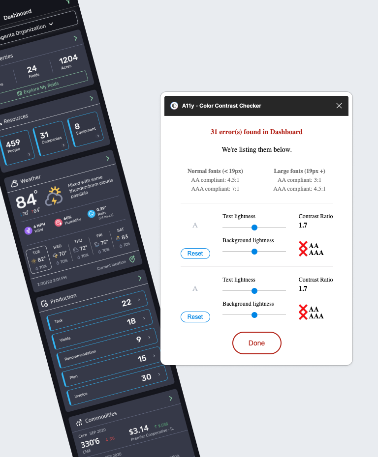
For example, inside Cropwise Financials this meant there was a single page dedicated to a handful of loosely scattered dark-mode screens, some relevant to the Financials iOS app while others were labeled as reference or old. There were no notes to indicate how to apply this dark-mode coloration to new screens.
A sample of Cropwise Financials dark-mode screens made March 2022 with no annotations or documentation
Without the logic defined somewhere, this meant that every time designs involved iOS, designers would create the main flow in light-mode before circling back around to select a handful of key screens to manually translate them into dark-mode. Although designers would reference the dark-mode page, they always ran into the following problems:
The existing dark-mode pattern is mostly an inverse of the established light-mode, which breaks the very first rule of dark-mode— Don’t just inverse your light-mode palette. This leads to unpleasant interfaces at best and accessibility problems at worst.
Manually creating dark-mode designs created inevitable excess handoff back and forth in the form of (A) misalignment with the coded semantic variables developers were using in the interface and (B) omitted screens or components that developers wanted to see in dark-mode.
Severe color contrast accessibility concerns
Cropwise Financials developer semantic color variables
Problem #3
Future color palette updates will require significant manual effort to change all relevant components.
If suddenly tomorrow the company decided that all informative banners, copy, and other related components should be updated to a magenta color scheme, it would take a global initiative rallying a significant number of designers to manually dig through all the screens of their product to find the relevant components and create new designs indicating the color change. Unfortunately with our current system, there is no way to short cut that manual labor.
Project Objectives
Lay the foundation for global Cropwise semantic color variables
1.
Define a system for intuitively naming Cropwise colors based on their usage in a way that can be easily adjusted or expanded upon.
2.
Create light and dark-mode variables for the most basic, essential, and commonplace use of color.
The following were left out of scope due to the limited time frame:
Updating, adjusting, or adding to the current Cropwise primitive color palette
Defining product-specific color usage
Updating all global Figma components with the appropriate new semantic variables
Research
Heuristic Evaluation
Understanding color use across Cropwise products
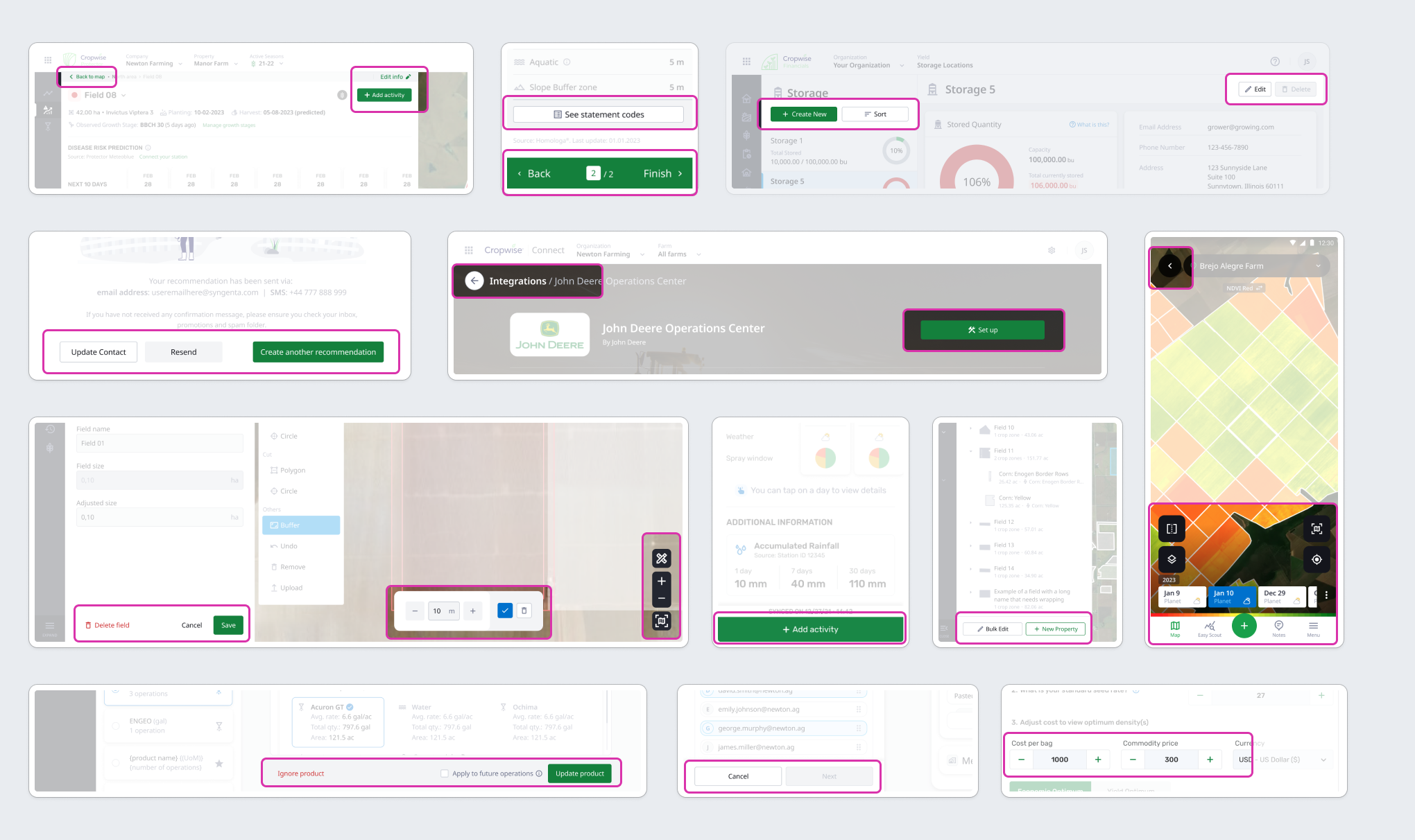
To better understand both to what extent colors are inconsistent across products and how colors are used, I reached out via direct group messages in Slack to specific colleagues before Design System Week requesting that they share with me a handful of key screens they could identify for me within their products. I wanted their expertise to direct me rather than my own assumptions and somewhat blind navigation through production and local Figma files.

Heuristic evaluation FigJam board with screens collected from eight major teams
Solution
Convert the primitive palette to variables to reduce the manual effort for future color palette updates
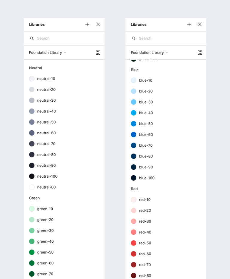
It was necessary to first translate our existing primitive color palette from color styles into variables so that they might link to the semantic variables. This aliasing allows “any design token to inherit the value of another design token…Styles don’t support aliasing…[so] they cannot be applied to variables and other styles” (Figma: The difference between variables and styles).

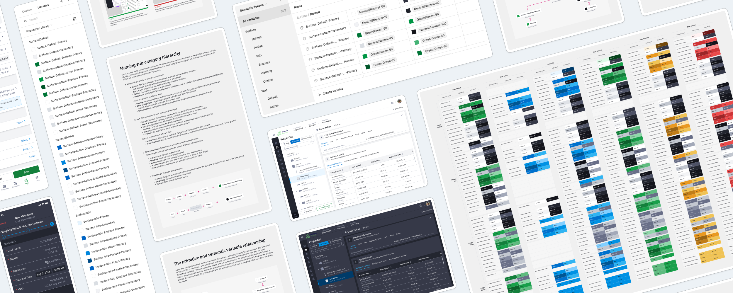
Cropwise primitive color palette as variables
This way, “if a global token changes, then everything downstream changes” or “if we only want some [changes], this structure allows us to choose the correct token upstream and change it without having to manually rework everything downstream” (Figma: The difference between variables and styles). So once all variables are properly linked, all future color changes should take the reasonably simple effort of a single designer.
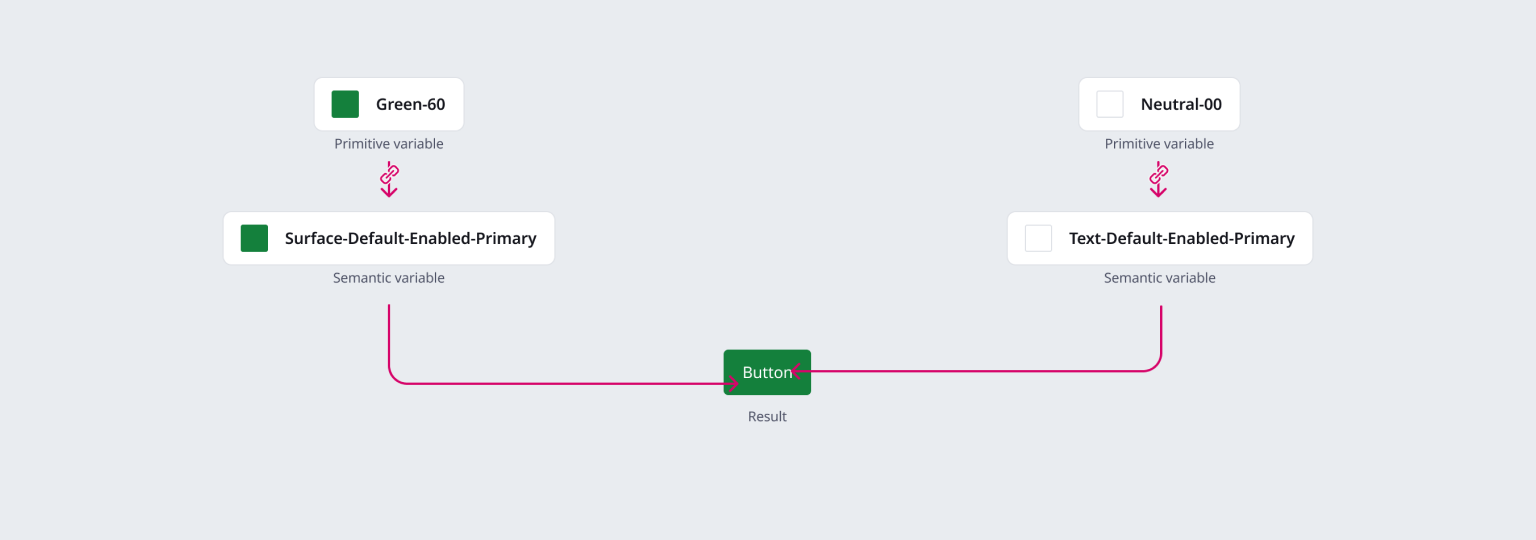
Linked Cropwise primitive and semantic variables for a primary button
Define the semantic color naming convention based on usage to reduce varied interpretations
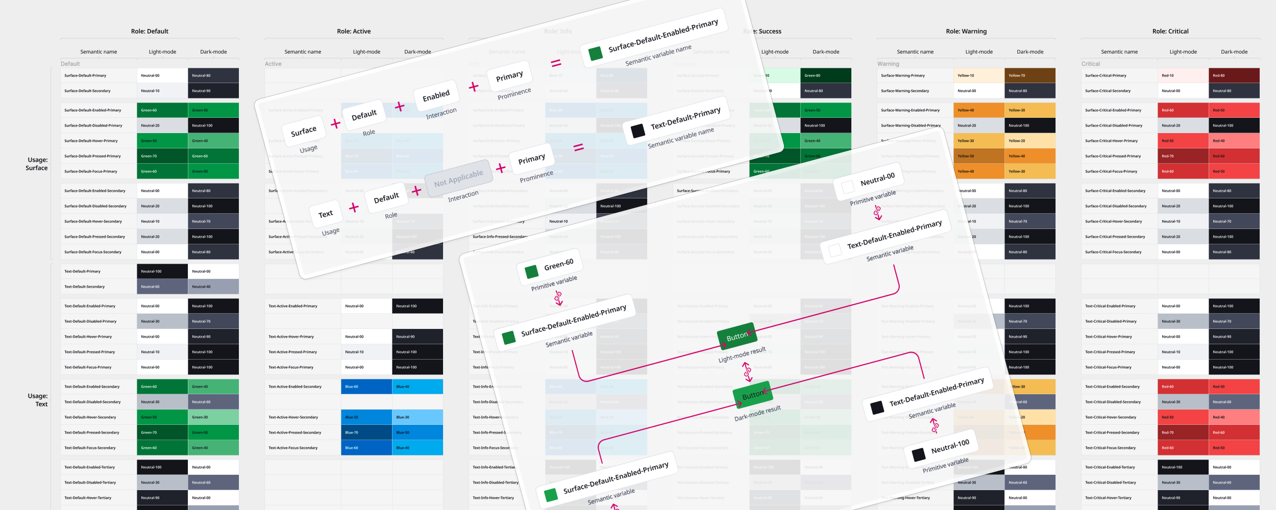
There are four major pieces that comprise the Cropwise semantic naming convention.
Usage: Where a color is used on a component
Surface: The fill or the layer that’s perceived as the background of any container
Text: Any copy that sits within the foreground of a container
Icon: Any pictogram that sits within the foreground of a container
Border: The general stroke or outline of any container
Indicator: A speciality border usually used to highlight a card or row
Role: The general sentiment trying to be conveyed
Default: The baseline theme used to build the general Cropwise interface
Active: Designates a choice, selection, or indicates in-progress or pending status
Info: Conveys important information that benefits the user to know
Success: Confirms positive feedback to the user
Warning: Calls attention to non-critical problems and conveys caution before something severe
Critical: Call attentions to errors and destructive actions
Interaction state: Responsive visual communication to user input
Enabled: An action can be performed
Disabled: An action cannot be performed
Hover: Response to the user placing their cursor over a component
Pressed: Response to a user click of their mouse or press of their finger
Focus: Indicates a component is activated and ready for input
Prominence: The order of important
Primary: The single most important action a user can take or the layer that’s closest to the user in the foreground
Secondary: Second-level actions and layers
Tertiary: Third-level actions and layers

Semantic naming convention pattern
With a little bit of onboarding, this pattern both defines color use in a clear enough manner for designers to readily use while also providing enough flexibility for additional variables to be added later. For example, additional usage, like overlay or focus highlights, or roles, such as Cropwise and Syngenta specific branding or data visualization, that I was personally unable to include given the timeframe can easily be incorporated at a future date.
Variable modes allow designers to immediately switch context, no manual rework required
With light and dark modes attached to each semantic color variable, designers can build in whichever mode they prefer and theoretically never have to manually design duplicative screens in another mode again because all colors will be linked by semantic use.
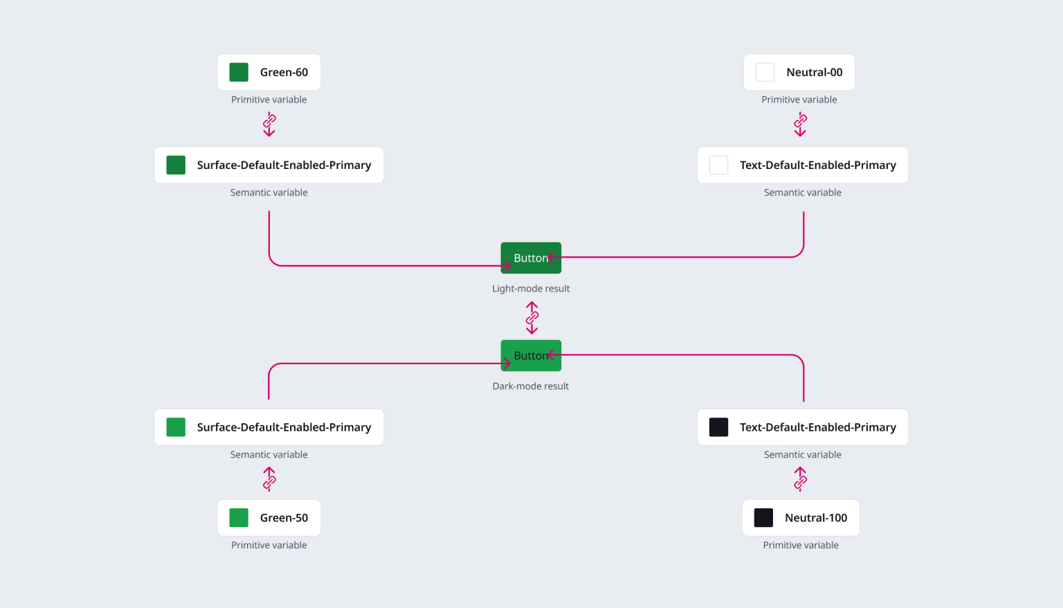
Linked light and dark modes for a primary button
By literally dragging and dropping or copy-pasting a screen into a Figma layer defined by a chosen mode, all colors utilizing variables will automatically adjust within seconds.

Sample Cropwise Financials screens in light-mode

Sample Cropwise Financials screens in dark-mode
Results
Next Steps #1
Apply the defined semantic color variables to our Cropwise global components
Unfortunately laying the foundation and providing proof of concept doesn’t actually provide the global Cropwise design chapter with the comprehensive tools they need to understand how semantic color variables work and implement them into their workflows. Comprehensive documentation is needed to communicate the language effectively, including a demo or two. And to alleviate the majority of the effort, all global components need to have their color styles updated to variables.
Next Steps #2
Review the primitive color palette to improve accessibility inside dark-mode
Even though modes will reduce manual design effort manually translating screens to zero, if our primitive color palettes aren’t appropriately accessible, then they do us little good. Our palettes should be evaluated for the necessary range in colors needed for the flexibility of accessible light and dark-modes.
Next Steps #3
Create more tokens for more comprehensive color usage across all Cropwise products
The various Cropwise products will need to be evaluated for additional usage, roles, and even modes that can be added to our variables. The more we can bring into this system, the easier it will be to maintain and manage in the long-term.